
How to Get Color Right
How to Get Color Right
Author: Shiguang
How do you get color right? Did that question send your mind somewhere naughty? No—this is a perfectly respectable science article. So let me show you a picture with some color in it. Entirely innocent, see? The cute little object below is a color wheel. It will be the star of this article, so take a moment to remember its shape.
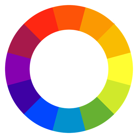
We will cover the basics of color, followed by several common approaches to building a palette.
Color Theory and Color Schemes
How Do Humans See Color?
In nature, light leaves a source and strikes an object's surface. Most objects absorb some of that light and reflect the rest into our eyes; the reflected portion is the color we see. An object that absorbs none of the light falling on it, reflecting everything unchanged, appears white. At the opposite extreme, an object that absorbs all the incident light appears black.
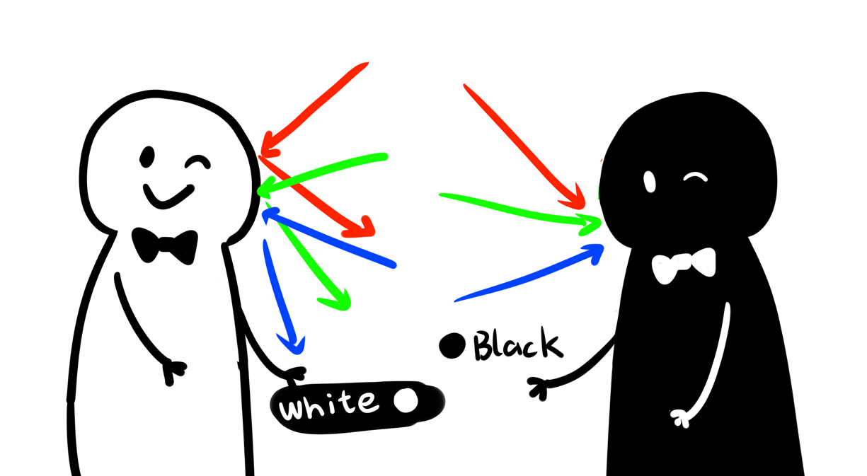
This is subtractive color mixing, represented in multimedia by the CMYK model. We encounter it in printers and anywhere else that color must appear on a surface that does not emit its own light. Since the object cannot glow, the color we see comes from light reflected by the ink.
The RGB model works the other way around, and you are probably more familiar with it than with CMYK. RGB stands for red, green, and blue, the three primary colors of light. Mix them in different proportions, and you produce new colors. This model is used in devices that emit light, including televisions, computers, and phones.
Now that we know the two basic color models, how do we turn individual colors into a successful palette? Let us look at several tried-and-tested approaches.
Monochromatic Color Scheme
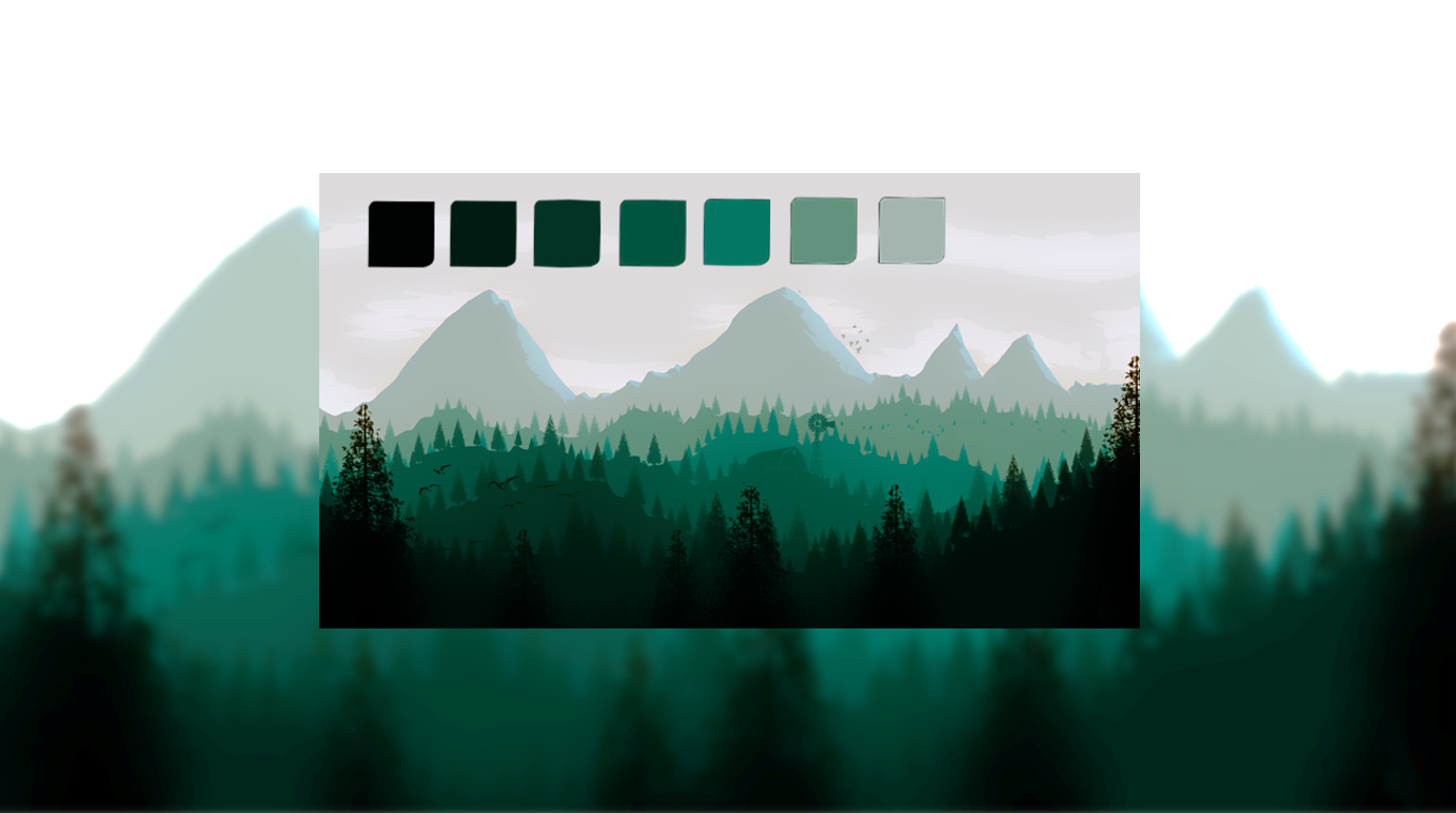
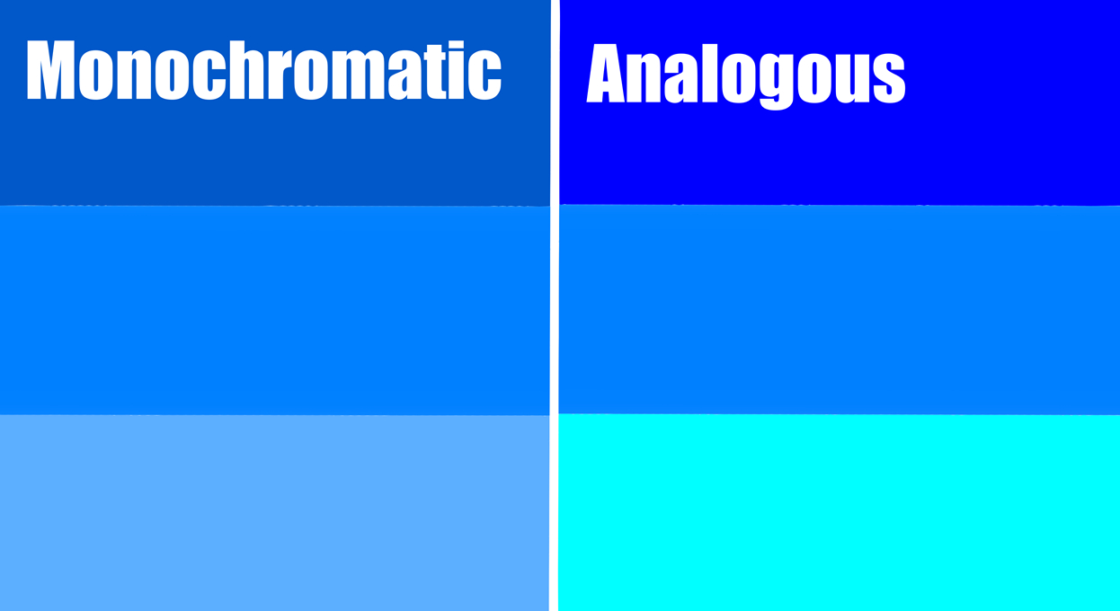
A monochromatic scheme may be the most harmonious option. The colors in this example scarcely clash at all, giving the whole image a clean, balanced feeling.
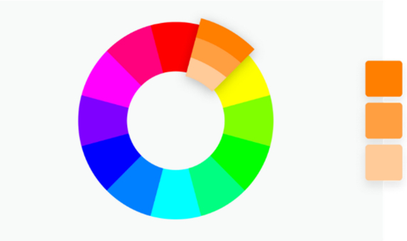
The harmony comes from starting with one base color, or hue, then creating the rest through changes in lightness and darkness, as the color wheel shows. With no other hue competing for attention, the result looks simple, clean, and refined. Its weakness is equally obvious: monochromatic color leaves little room for variety.
Complementary Color Scheme
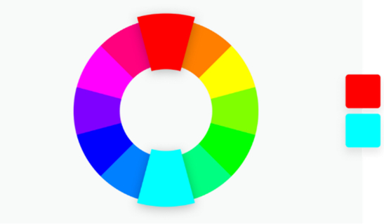
If a monochromatic palette feels clean, open, and harmonious, our next scheme is much livelier. Any guesses? Type yours in the group chat.
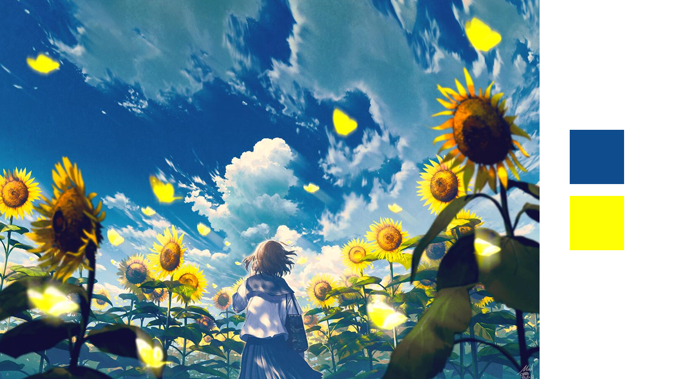
The answer is a complementary, or contrasting, color scheme. Complementary colors create a strong contrast. They sit at opposite ends of the color wheel, so their warm–cool qualities—and the feelings they suggest—pull in opposite directions as well. Put them side by side, and the tension is hard to miss. Handled well, it can look spectacular.
UI designers often use complementary colors to draw attention to important information. Painters can use the same tension to guide the viewer's eye directly to a chosen focal point. The drawback is clear too: too many competing contrasts quickly become dizzying and chaotic.
Split-Complementary Color Scheme

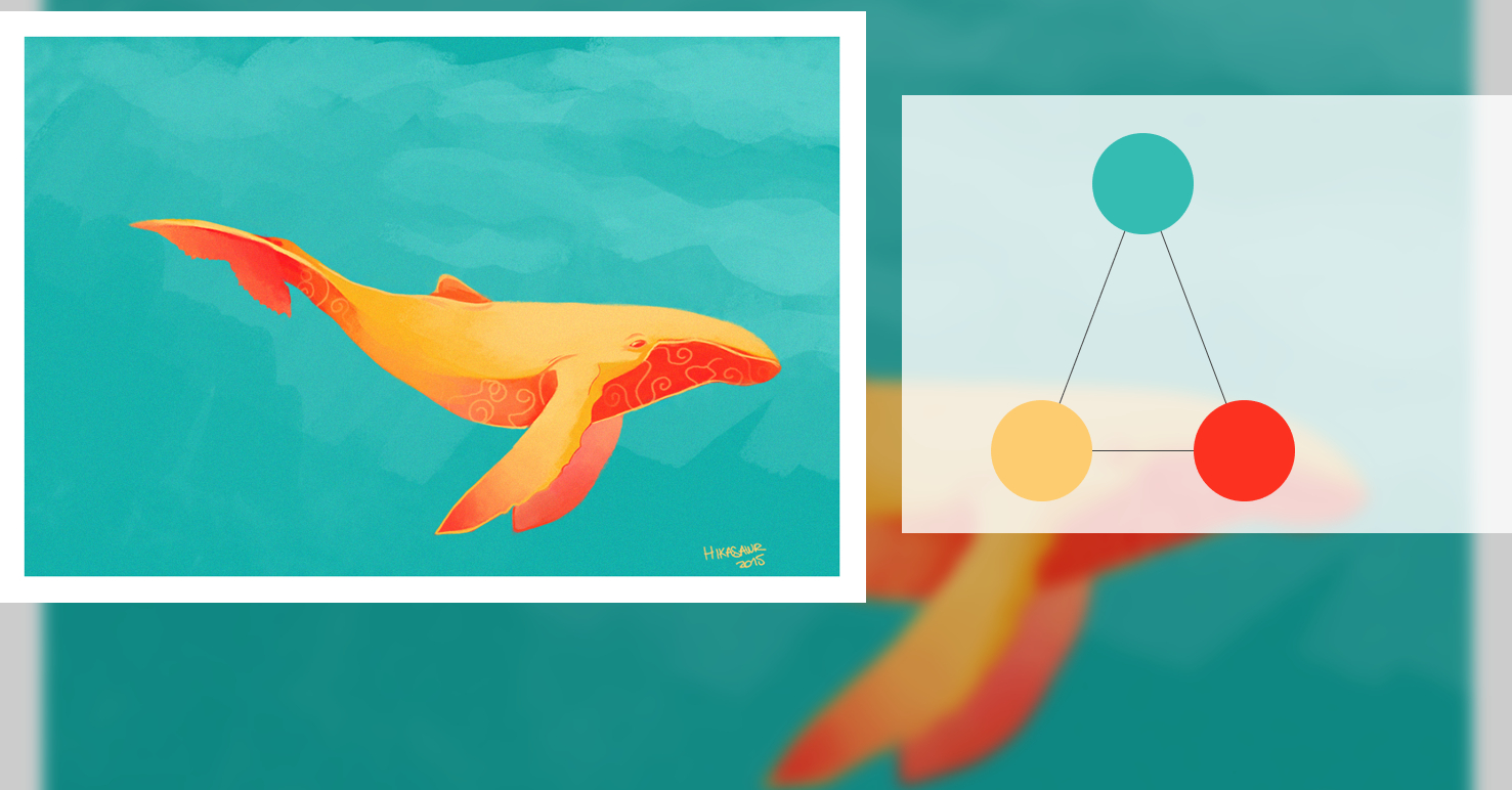
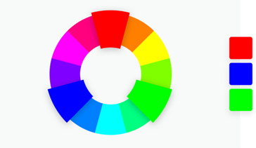
Next is the split-complementary scheme. As the diagram shows, it combines one base color with two secondary colors placed symmetrically on either side of its complement, forming a narrow triangle on the wheel. The palette contains either one warm color and two cool colors, or one cool color and two warm colors.
Compared with a direct complementary pair, split-complementary color feels more balanced and gentle. The hue at the triangle's narrow point usually dominates, while the other two often provide lighting or accents. The result keeps much of complementary color's visual energy without the head-on collision. As the wheel makes clear, this is essentially a variation on the complementary scheme; the key difference is that its contrast is less intense and exaggerated.
Analogous Color Scheme
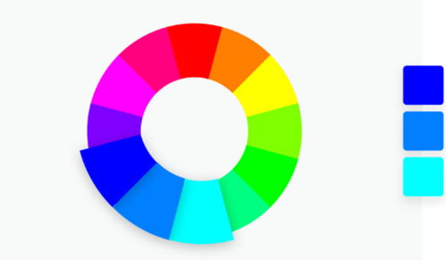
Our next scheme combines the strengths of the two above. It is less monotonous than monochromatic color but less aggressive than a complementary pair. Use it flexibly, and you can build an interface that feels both harmonious and lively. The name? Analogous color.
Analogous colors sit near one another on the wheel and create relatively little contrast. It is an exceptionally versatile scheme. Compared with a monochromatic palette, it plainly offers more hues, yet preserves their subtle harmony and balance. That makes the result richer and more colorful—ideal when a design needs greater variety.
Analogous colors are also far gentler than complementary ones. The scheme is a dependable all-purpose choice, which is why it appears almost everywhere.
Triadic Color Scheme
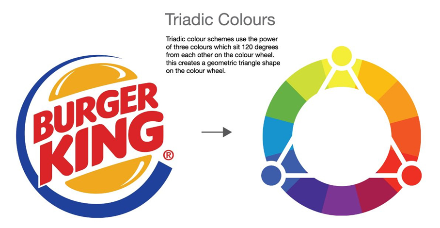
A triadic scheme takes three colors spaced evenly around the wheel, giving every pair some contrast. All three can act as major colors, producing a vivid, attention-grabbing effect. That makes balance especially important. The contrast among the hues is useful when a design needs each color to stand apart, but divide the image equally among all three and the impact may become so strong that the result loses its beauty.
There are exceptions. An equal split works when the image itself implies equal parts—three buttons for three equivalent functions, for example. Once the composition grows more complicated, giving every color the same weight tends to create a mess.
To handle a triadic palette well, make one or two colors dominant and use them to hold the others in check. Let one hue occupy most of the image, with the rest appearing sparingly as accents. You can also choose one softer tone to temper the other two.
Rectangular Color Scheme
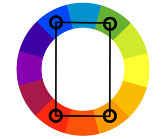
What happens when you choose two opposing pairs from the color wheel? You get a rectangular, or tetradic, scheme—even more unruly than a triadic palette. The four hues have no obvious hierarchy, but the two pairs of contrasts create a bright, vivid result. The combination can make a powerful impression, though it takes planning and careful work to use well.
As the number of colors grows, harmonizing them usually becomes harder. Rectangular schemes work best in evenly divided situations, such as a set of four buttons. Another option is to lower the contrast and blend the colors into a deliberately intricate effect.
Color Psychology
Now that we know the basic schemes, how do we choose among them? Before we start working with color in earnest, we need a little “color psychology.” People often assume that color choice comes down to a designer's taste and aesthetic sense, but the process is more complicated than it appears. Choosing well matters enormously. As the table below shows, different colors tend to evoke different feelings.
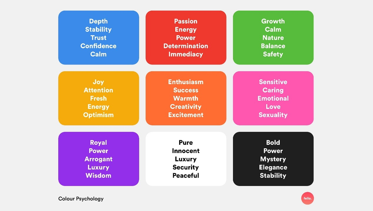
Red, for example, is associated with passion and hot-blooded energy, but also with aggression and attack. It has two sides: love and confidence on one, anger on the other. Either way, red demands attention, which often makes it an effective tool for directing a user's eye.
What do you picture when you hear “green”? Even if they are not your first thought, dense forests and flourishing grasslands soon come to mind. Green feels full of life, so it is a poor fit for negative or pessimistic imagery. For that, we are more likely to reach for shades of gray.
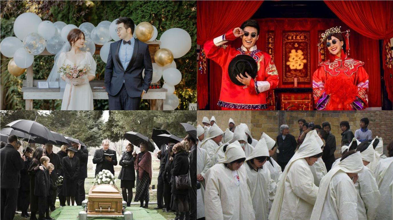
Color psychology describes how most people feel, not how everyone must feel. Some people see green and think of plague, disease, or death. Culture also changes what a color means. In Western cultures, white represents holiness and purity and often appears at solemn, sacred occasions such as weddings—hence the white bridal gown. In traditional Chinese culture, however, white can symbolize death. In the phrase “red and white happy occasions,” a “white happy occasion” is the funeral of an elderly family member.
Choosing a color therefore means considering both the response we want from an audience and the special meanings that color carries across cultures.
Putting Color to Work
With the basics of color schemes and color psychology behind us, it is time to put color to work. But how do we choose the first hue? As we have seen, the decision matters; the wrong color can kill a design. Two things deserve attention: the audience and the subject.
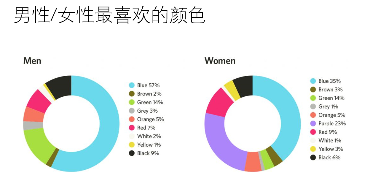
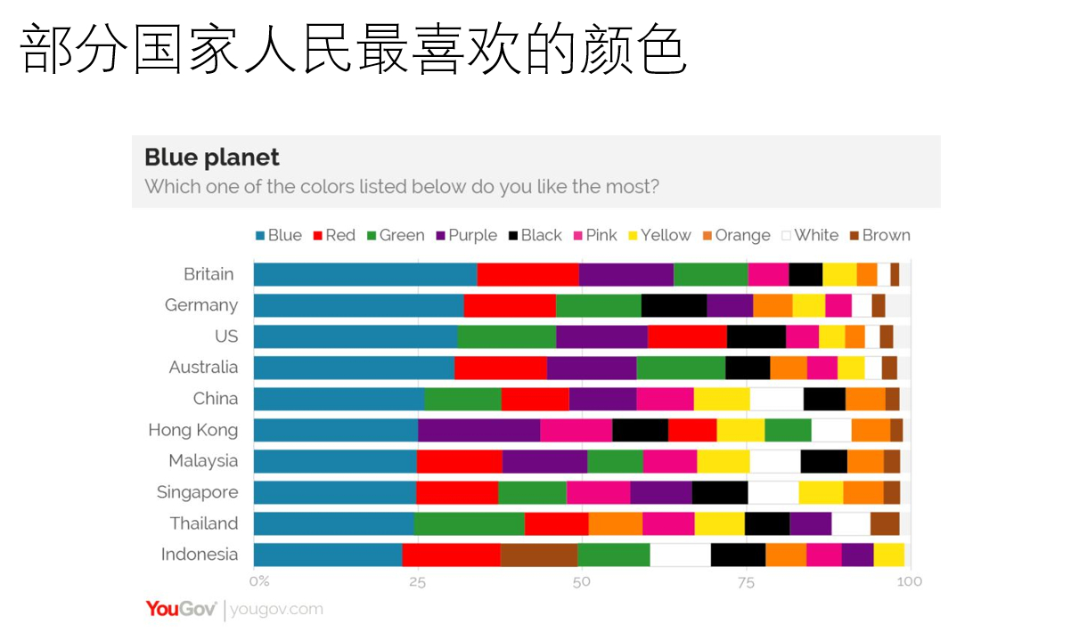
If the audience includes everyone, what is the “safest” choice? Blue. Open your phone and blue-centered apps are everywhere: the default themes for QQ, Alipay, Twitter, Pixiv, and many more. Why blue? The chart below shows it as the most popular color among both men and women, meaning it appeals to the largest share of the audience. Cultural differences among countries do not change the result: blue also takes the largest share in every country listed. In color-psychology terms, it feels deep and comfortable while suggesting innovation, trust, and safety.
Now consider a more specific audience. For one made up mainly of women, warm colors such as pink, purple, and red may create a romantic, pleasing mood. For a mainly male audience, cool colors such as green, blue, and black may suggest calm, depth, or technology. Children and young people may respond well to the bold energy of complementary, triadic, and split-complementary palettes. For adults, a quieter monochromatic or analogous scheme may fit better.
The subject matters too. A painting or design about sports will often center on yellow, red, or green. The first two feel “energetic and passionate,” while green suggests vitality and the pursuit of success. Work and study are better suited to cool colors such as blue, green, purple, and even black, which can evoke intelligence and maturity.
You are now a mature connoisseur of color. The next time you admire a colorful picture, you can give its palette a proper analysis—and use today's ideas when choosing colors of your own. Thanks, everyone. That is all for today.
All articles in this blog are licensed under CC BY-NC-SA 4.0 unless stating additionally.
 爱发电(点击图片跳转)